Services delivered

Visual Identity
A visual identity born from an empathetic brand, with care for people
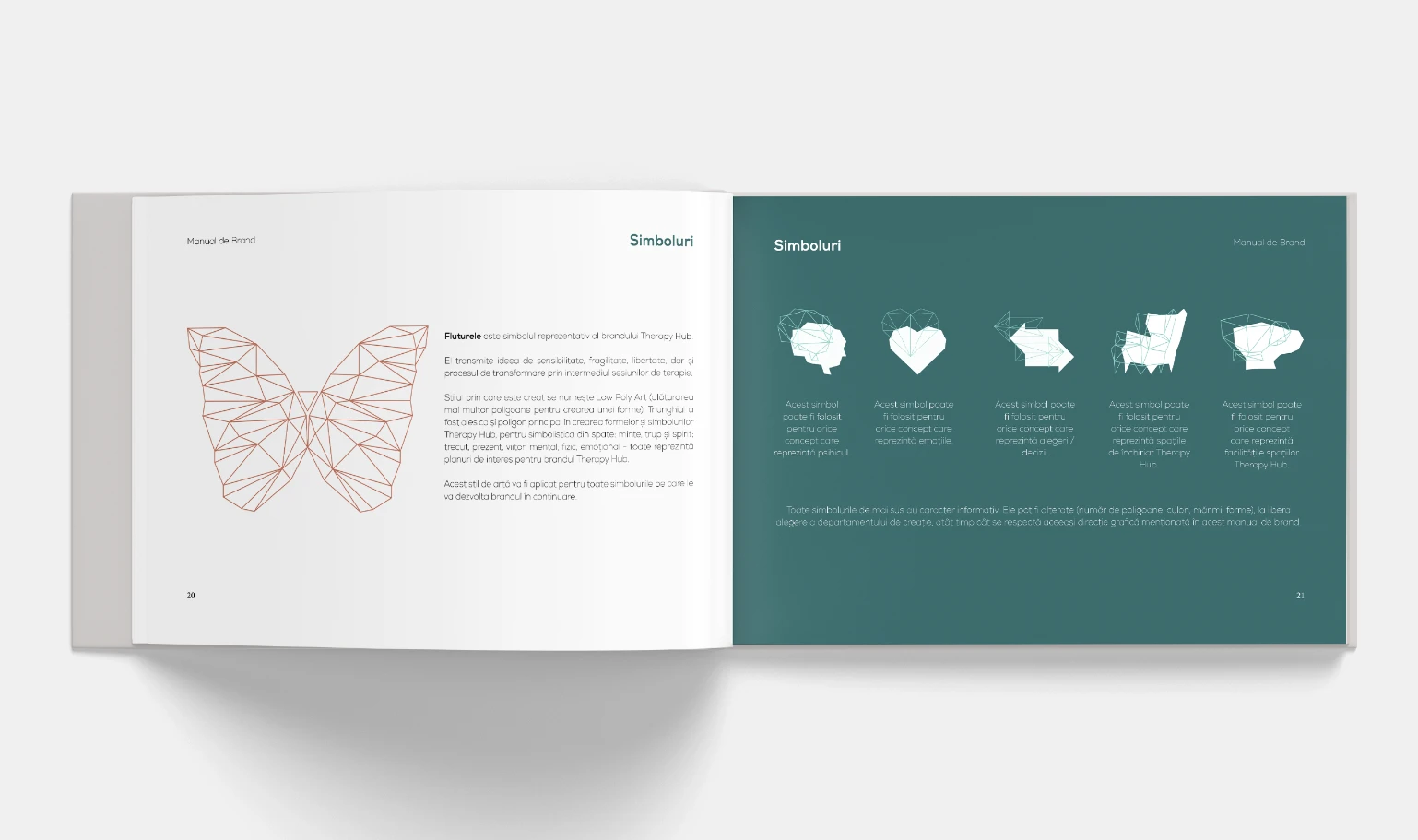
In our visual identity, we have embraced the triangle as a central element within the Therapy Hub design, symbolizing the intricate connections within our brand: mind, body, and spirit; past, present, future; mental, physical, and emotional facets—all of which hold significance for the Therapy Hub brand.
The colors orange, green and cream are the primary colors, because they express friendship, warmth, closeness, but also seriousness and professionalism.
(WHAT WE DID)
- Stylescape
- 4 Logo Drafts
- 1 Brand Board
- Logo System
- Identity System
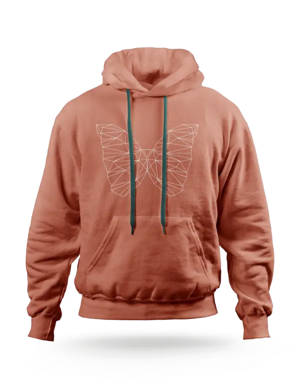
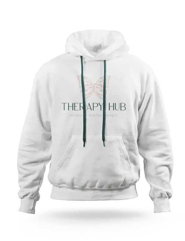
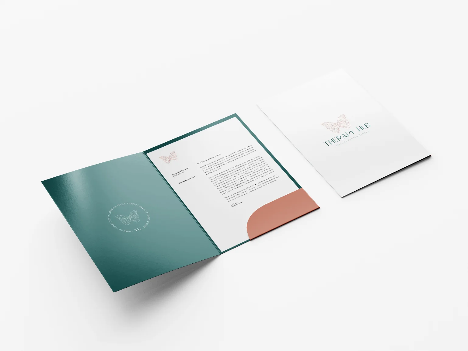
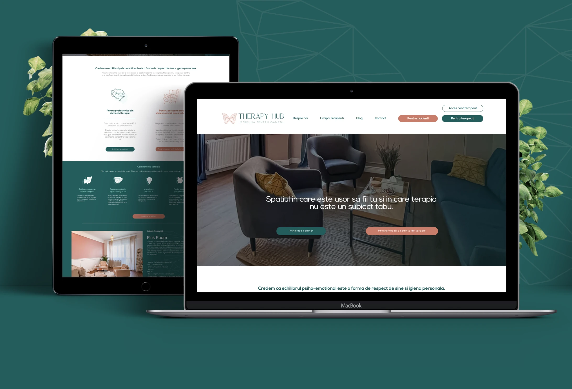
- Design Application (Online si Offline)
- Brand Activation
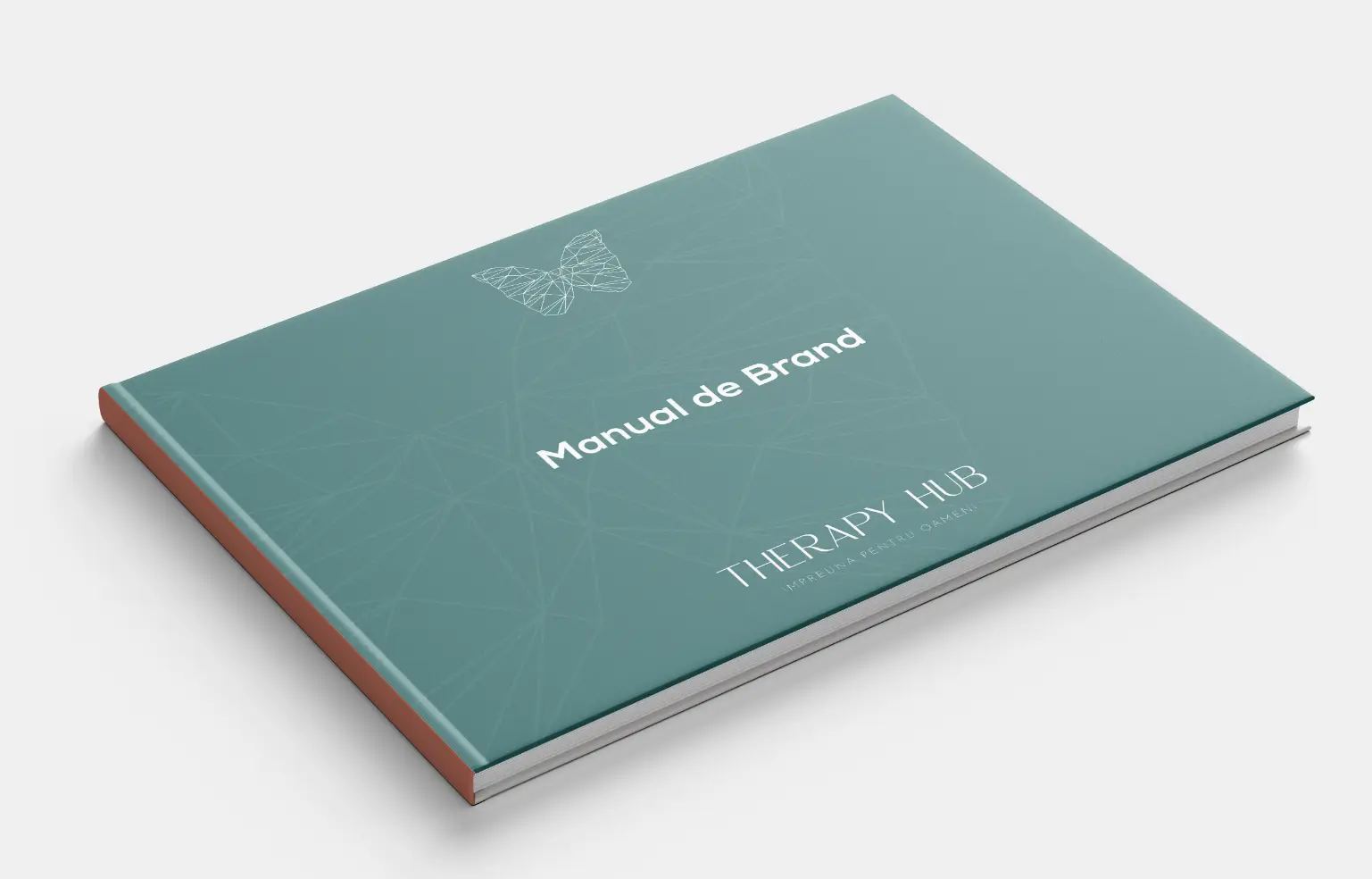
- Brand Guideline

Visual Identity /
Stylescapes
Several initial options, only one chosen direction.
The Stylescape is a collection of images that present different visual styles and has the role of identifying creative possibilities for the brand, with representative examples from real life.
*The elements that make up the Stylescapes are not created by Inobox. Image source here:
https://drive.google.com/file/d/1FWVkeIX62FCzEo1j1A5k71gzn3BWzBYT/view
Visual Identity /
Logo Drafts
Always a symbol with a story
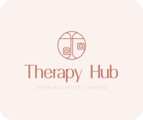
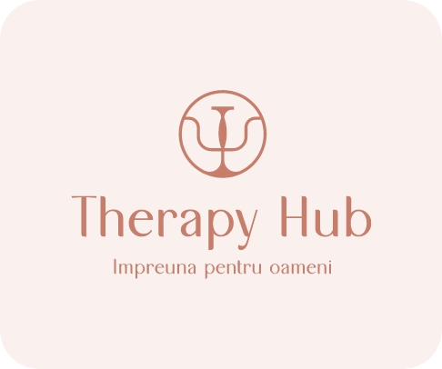
We presented 4 Logo Concepts to our partners from Therapy Hub, each with a story and symbolism behind it.



Visual Identity /
Logo system
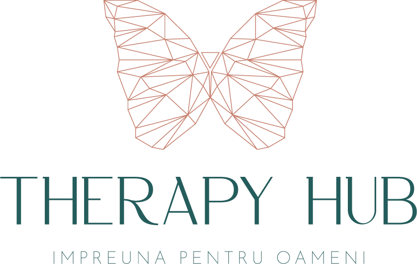
The butterfly – a symbol of transformation
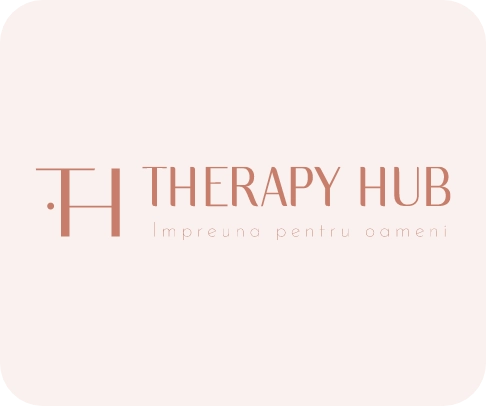
Finally, our partners selected the fourth version of the logo, featuring the butterfly as its central symbol. This choice aligns with the brand’s core values of fragility, sensitivity, freedom, and transformation, which were established during the brand positioning phase.
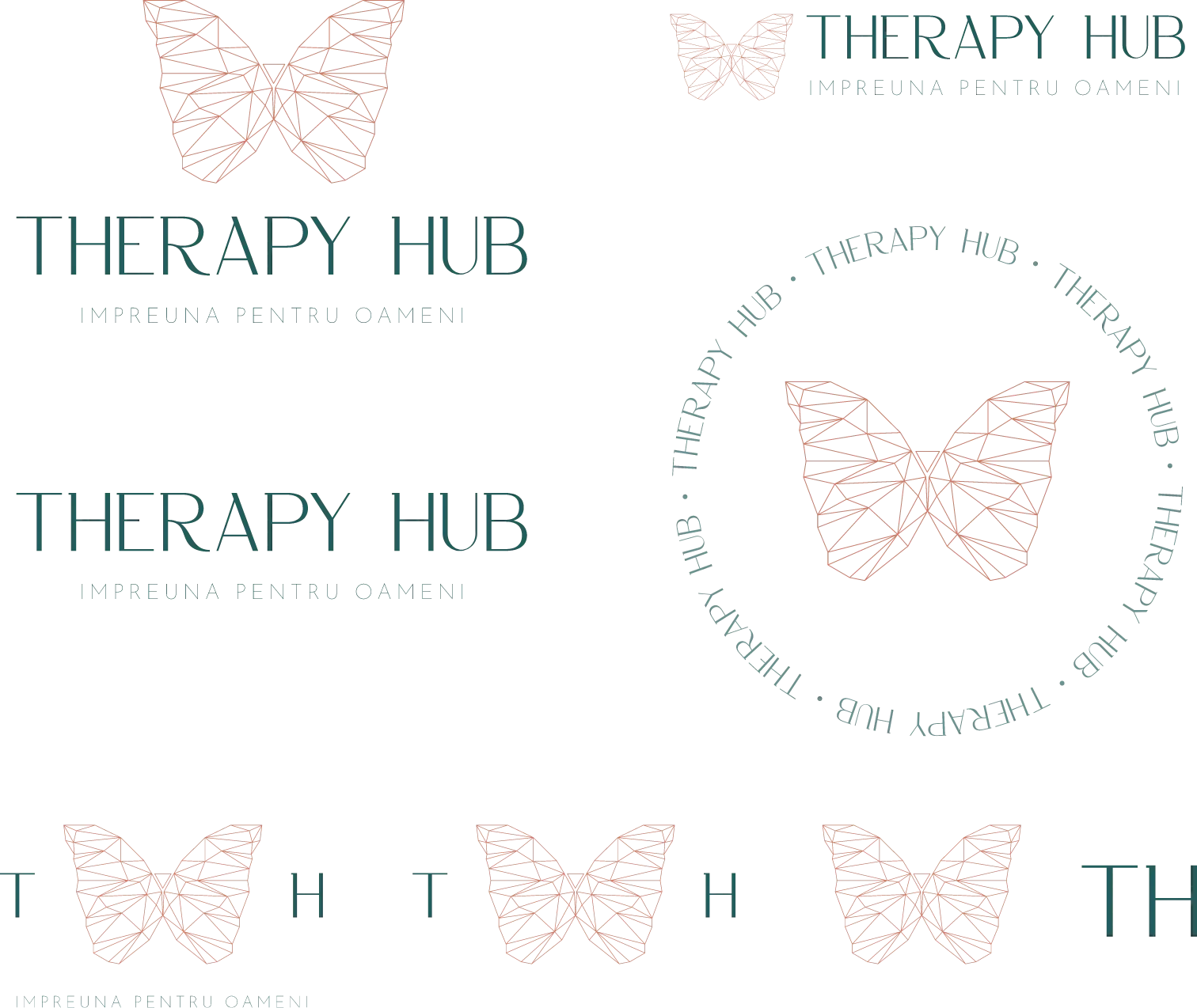
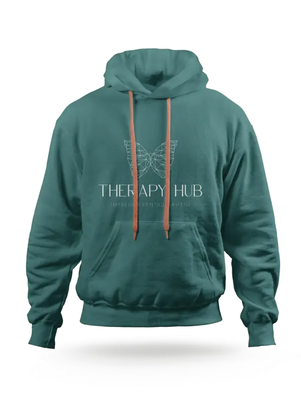
Every brand needs a Logo System, comprising various versions of the same logo adapted for different formats, orientations, colors, and elements. This ensures its versatility and optimal usage across diverse environments, sizes, and color schemes.





Visual Identity /
Identity System
Un stil vizual unitar, ce ofera unicitate, brand awareness si vizibilitate in piata
A cohesive visual style that provides distinctiveness, enhances brand recognition, and ensures visibility in the market.
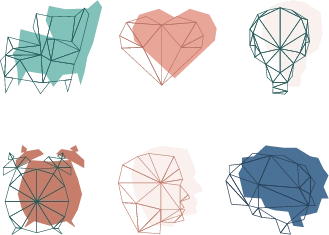
Our entire visual identity is rooted in simplicity, highlighting our brand colors, employing polyart-style symbols composed solely of triangles, and adhering to a clear and consistent font system. We have established and adhered to design principles that convey a sense of familiarity and professionalism while setting us apart from the competition.




Visual Identity /
Design Application &
Brand Activation
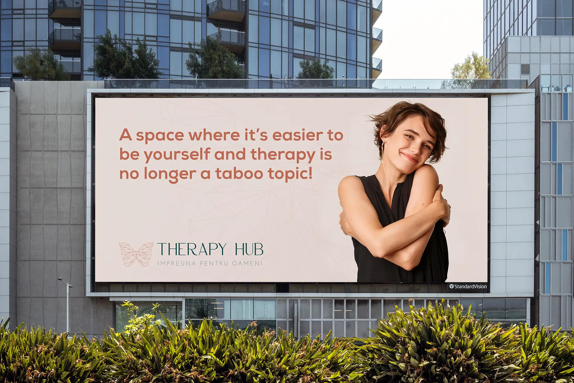
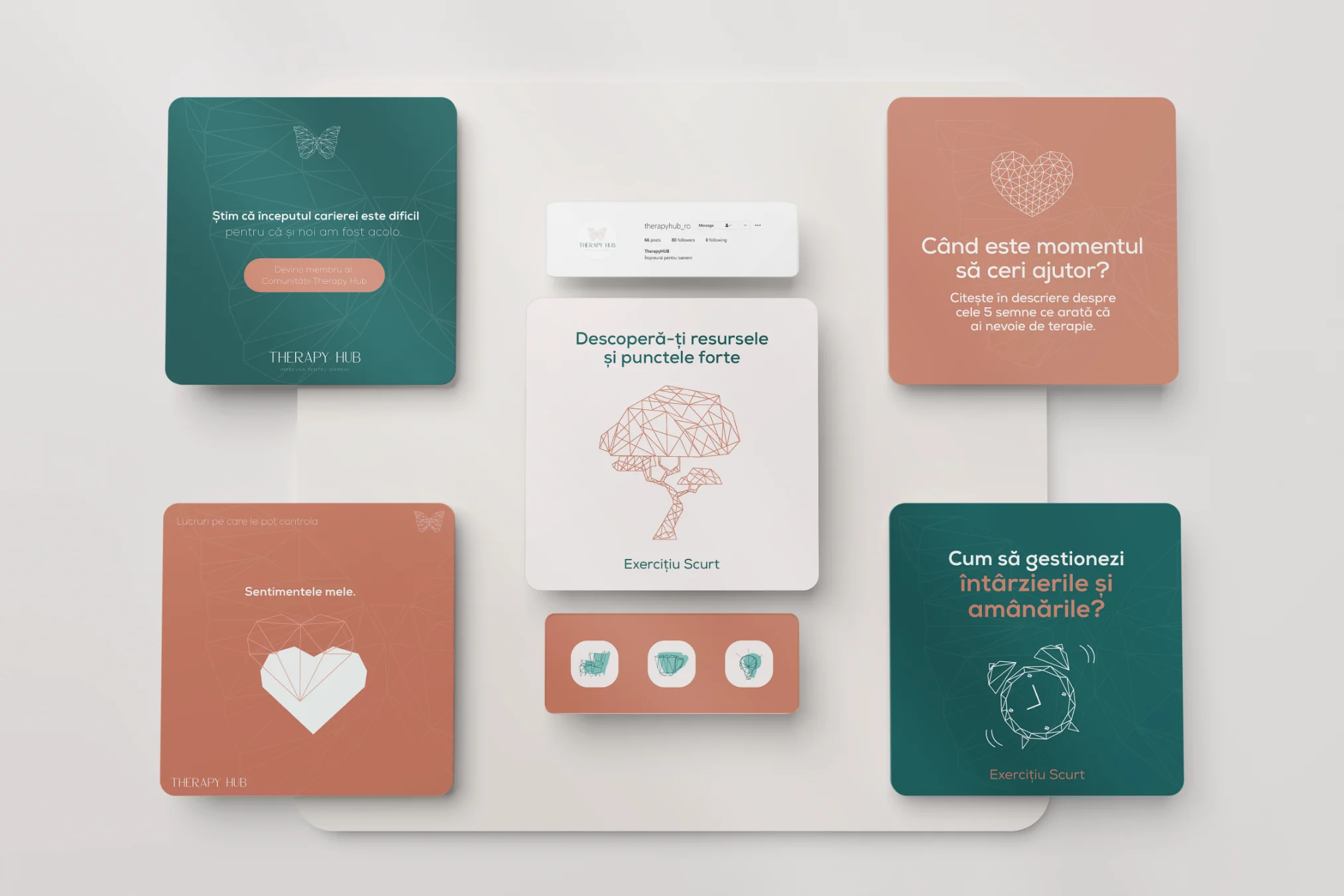
A unique visual style on all communication channels
(WHAT WE DID – ONLINE)
- Social Media Assets
- Ads
- Digital files (presentations, Worksheets)
- Website
(WHAT WE DID – OFFLINE)
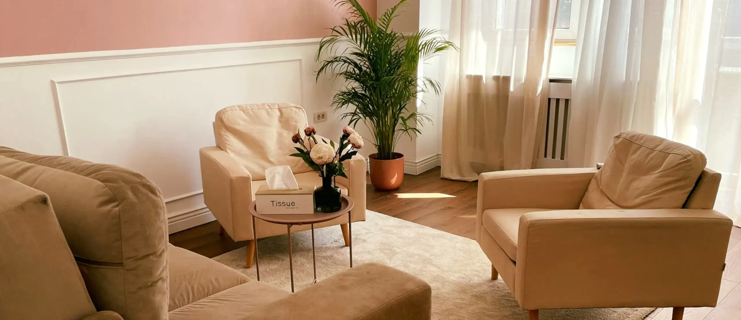
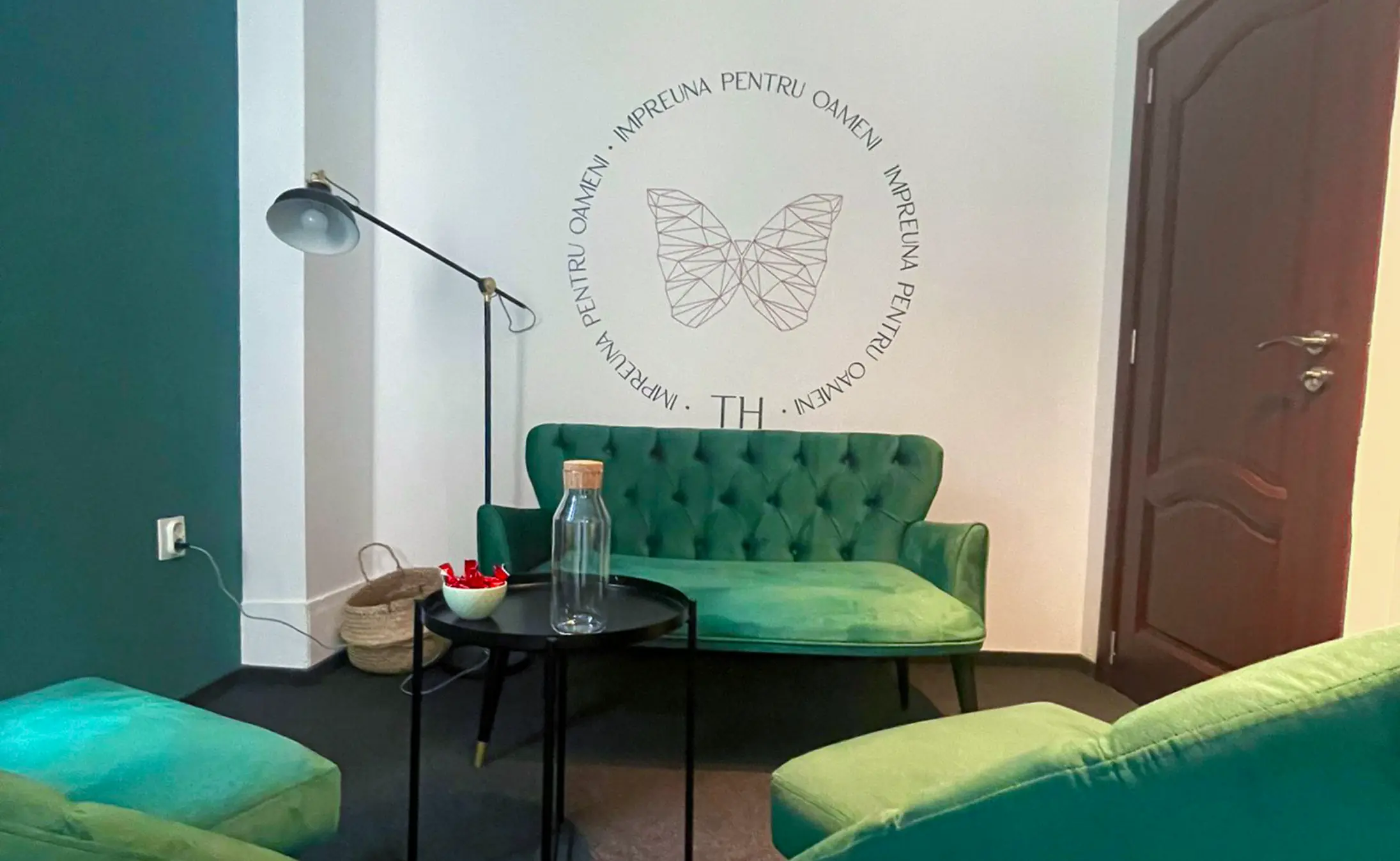
- Interior design graphics
- Banners
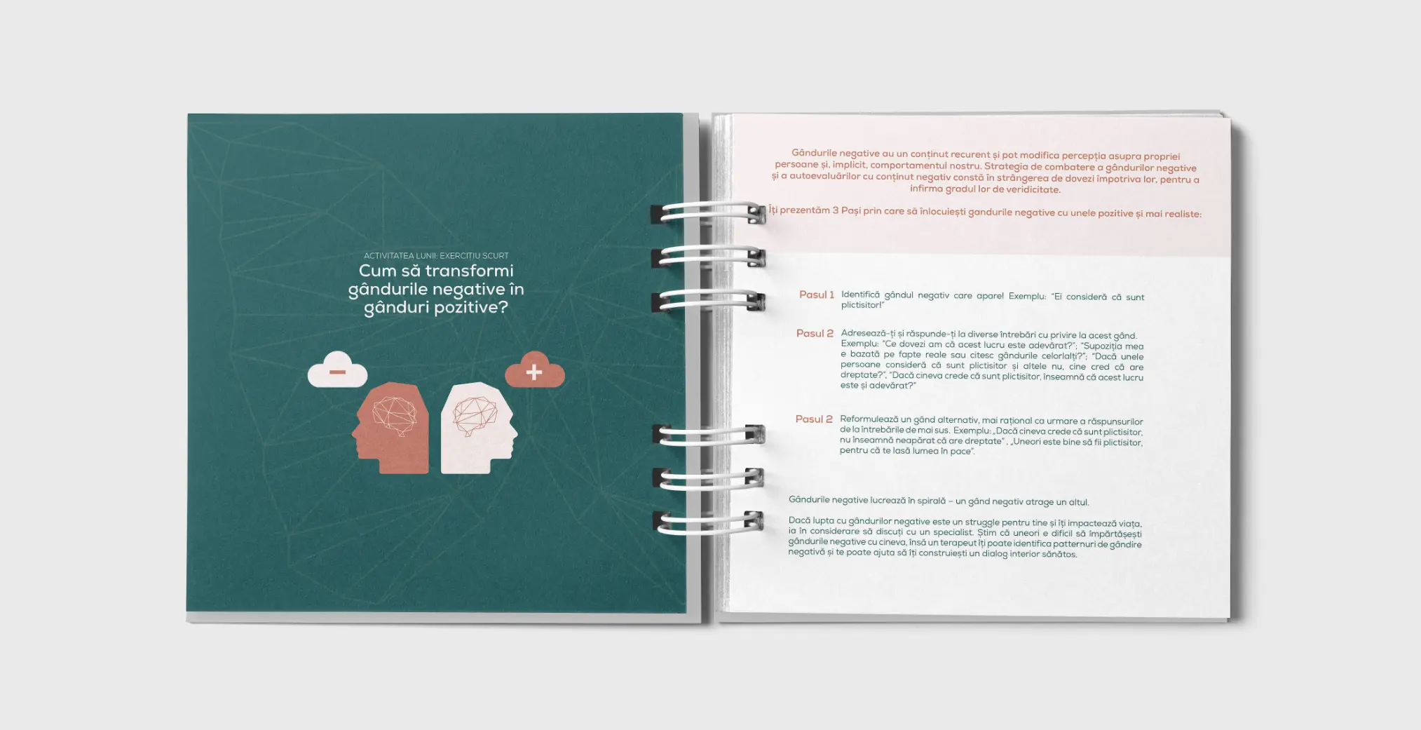
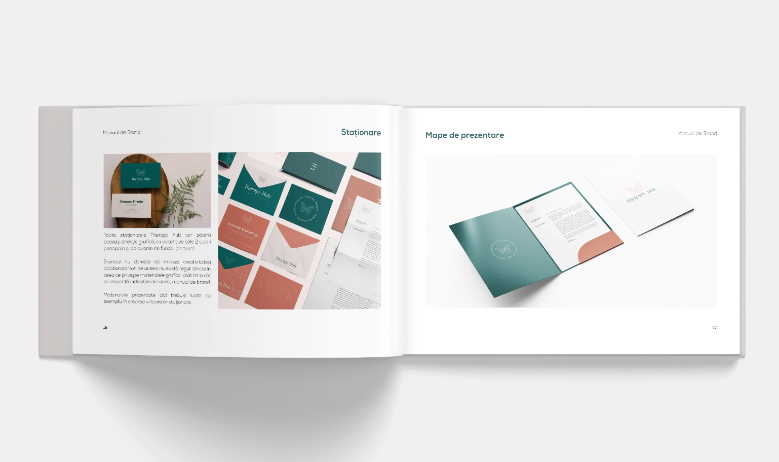
- Agenda and other brand stationery (business card, envelopes)
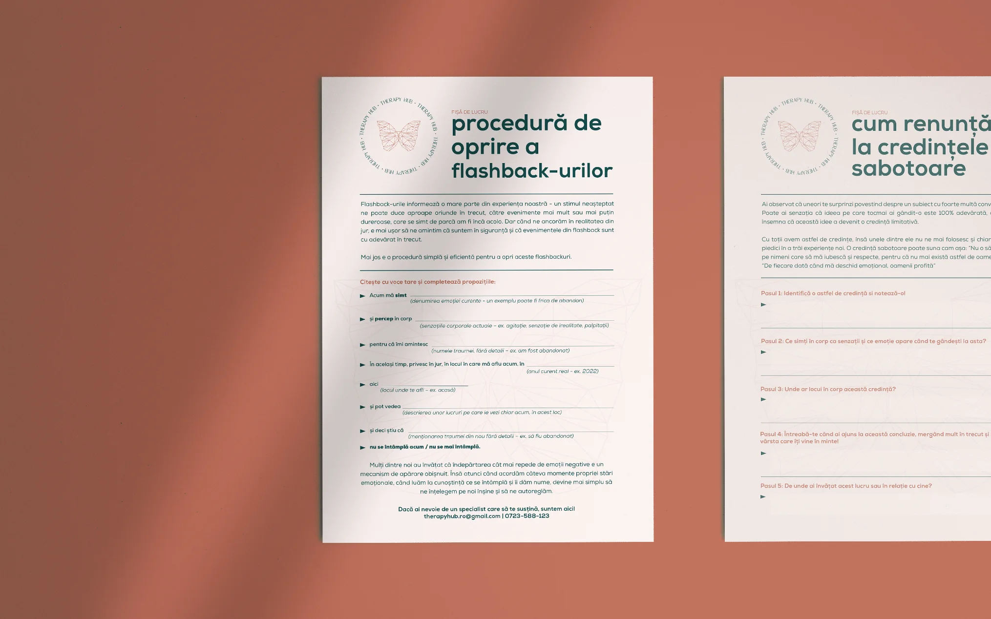
- Worksheets
- Presentations















together!


