
Therapy Hub
Services delivered
Market Positioning
Brand Personality
Verbal Identity
Logo Design
Visual Brand Identity
Web Development
Brand Collaterals
Brand Guidelines


1. Discovery, Research and Competition Audit
Having a strong desire to succeed from the beginning, most of our partners have no clue where to start their market analysis from.
To help them, we have a simple straight hand process in which we look at the competitors from several perspectives: their market positioning, their communication, visual identity and market reputation.
This kind of process helped Simona, our Therapy Hub partner. At the end of this process, it was clear for her what Therapy Hub market position would be and how it will be different from that of it’s competitors.


2. Client Avatar, positioning and brand promises
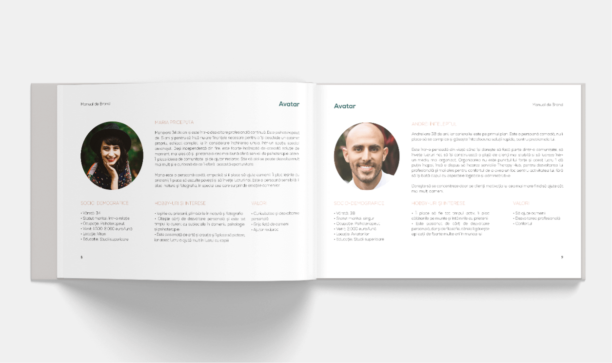
I’ve often seen nonspecific replies to the question “What is your avatar?” such as “she is a lady, 30-45 years old, married or divorced”… “all women in Romania, after all.”
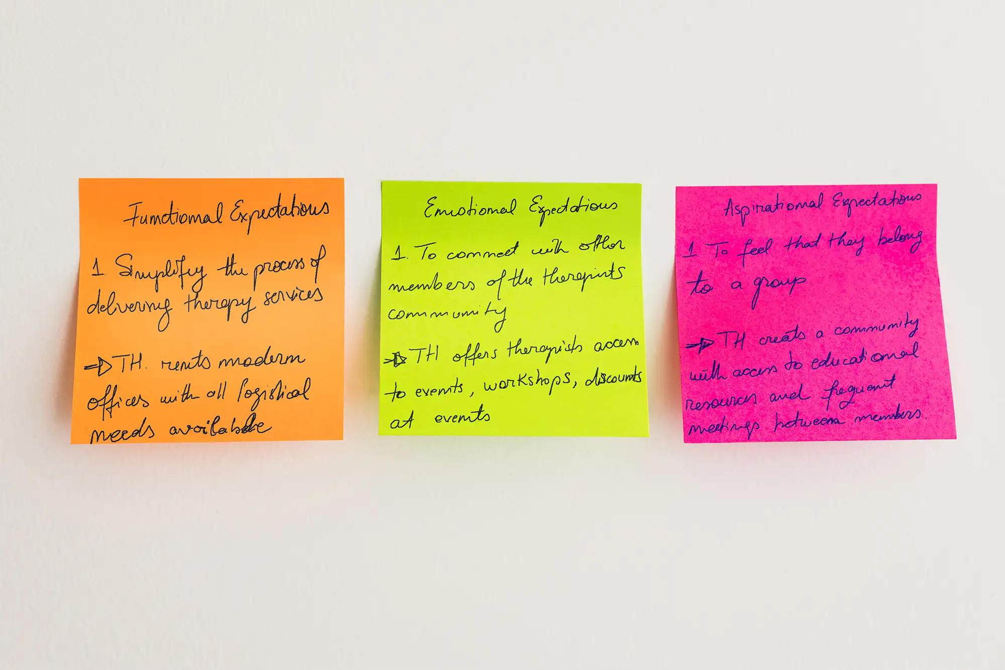
This is one method, but we like responses like “Our avatar is Maria, the Skillful one, a therapist at the start of her career who wants to be on her own, but lacks the necessary resources to open an individual office”.
We got this type of replies from one of our questionnaires, that our client completed at the beginning of the process, as well as from the market analysis from Stage 1.
As a result, we were able to determine a complete avatar profile and its expectations, and Simona felt at ease enough to make action decisions for her brand (see the examples below).

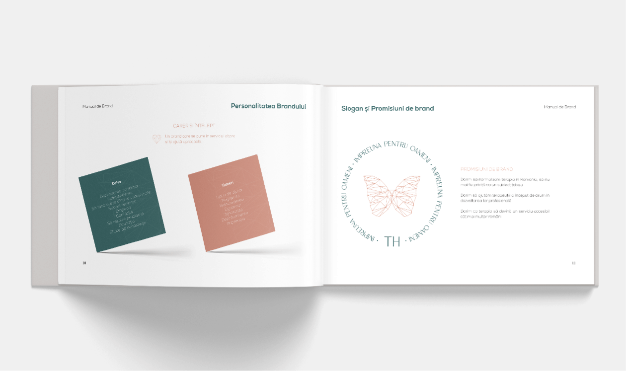
3. The Therapy Hub Brand's Archetype (Personality)
“I have no clue what an Archetype is!” we regularly hear from our clients. The lengthy answer may be found in an article we wrote here.
The short answer is giving human attributes to your brand, making it genuine, authentic, and believable.
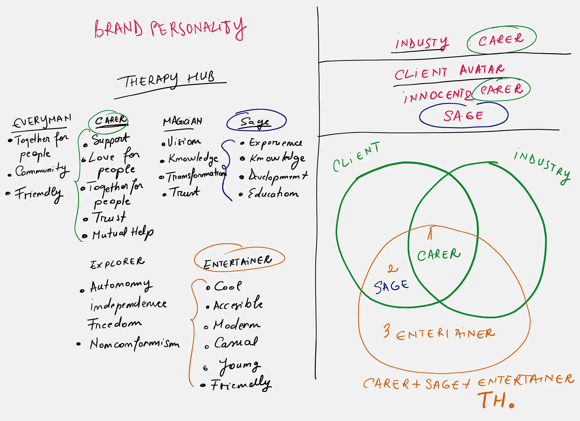
Our partner assisted us in identifying all of the Therapy Hub brand’s attributes. Later, we combined these attributes with what we discovered in the previous two rounds.
Our conclusion? We picked the Carer as the Main Archetype (because it is a brand with an emphasis on people and caring for them), and Sage and Entertainer as Secondary Archetypes (because it is a brand with an emphasis on education, information, and growth and because it is cool , friendly, approachable and does not hesitate to tell a joke to relax the atmosphere).


4. Verbal Identity
When it comes to verbal identity, we are all aware that in any business, you must be courteous, respectful, calm, and so on.
True. But do you really want to be genuine? Give your staff direction on how to communicate? Build a sense of familiarity for your customers and then emotionally connect with them?
If you want a healthy business and a unique brand, you will say YES to all of the above questions. And you’ll want to have a document with rules for how you communicate, when to communicate, and what words to use to connect with your audience.
Let’s see an example from Therapy Hub
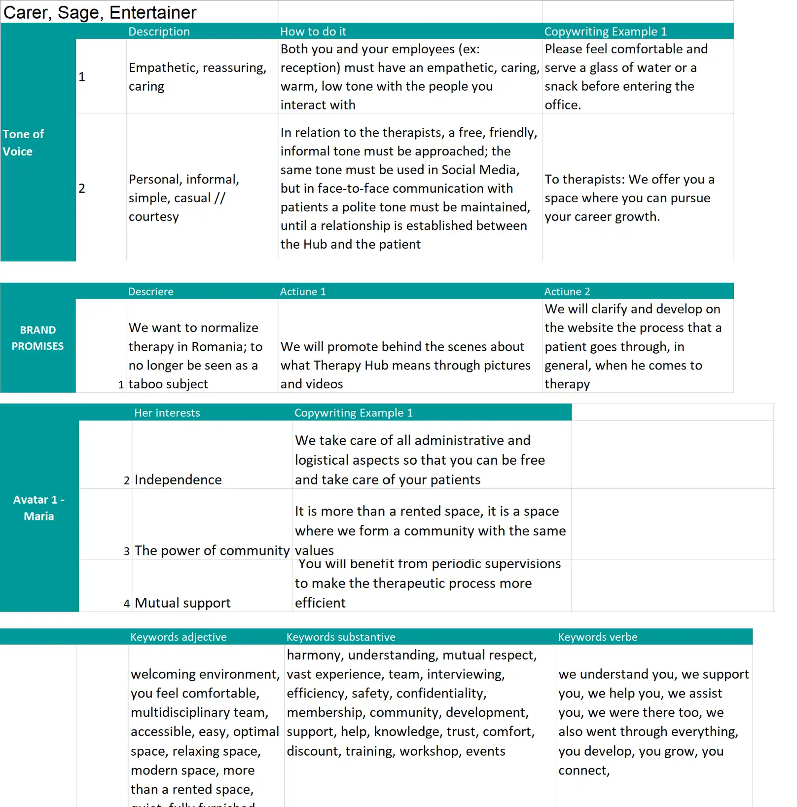
One of the emotional expectations of Therapy Hub clients is to reduce their fear of opening an office and the headaches that come with it. A message from the brand should use an empathetic, comforting, personal, and casual tone and sound something like this: “We know it’s hard, we understand you (personal, informal, empathic), because we’ve also been there (create familiarity). That is why we want to be there for you and assist you in your journey (empathically). We provide you the space (solution), and you are free to concentrate solely on your patients (satisfactory outcome for the therapist).”
5. Stylescapes
“Stylescape,” another term that piques the interest of our partners, but also one of our design team’s favorites.
The Stylescape is a collection of pictures, symbols, visuals, typefaces, and colors gathered from the internet or offline environment* that represent a specific emotion and help in making a graphic design decision.
The Stylescapes below were created for Therapy Hub, and the second one served as our inspiration for the company’s visual identity, which is a straightforward, serious brand with an emphasis on colors that show professionalism and confidence.
*The elements that make up the Stylescapes are not created by Inobox.


6. Logo
We all know that the logo is the most significant part of visual identity since it is the first visual contact the client has with the brand. Many partners are worried and ask us “if I don’t like the first version, what happens?” We tell them that we have a very solid idea of what is appropriate for the brand because we have previously gone through all of the planning stage (as you’ve seen above). Ideas emerge naturally during the process; at this point, we just put them into action aesthetically.
The four Logo versions created for Therapy Hub are listed below.
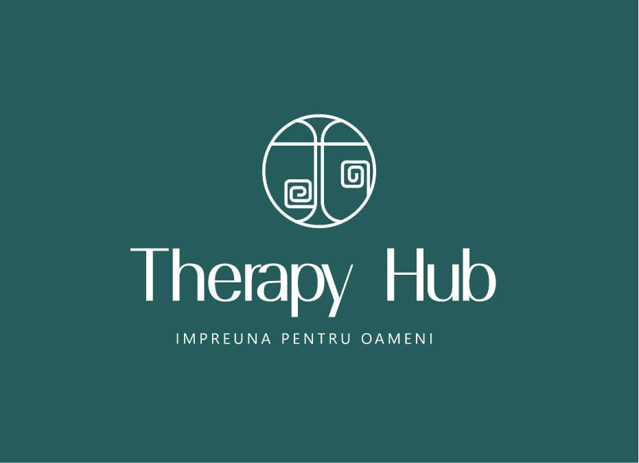

Version 1: Hidden Message
• An abstract concept, representing 2 person standing face to face, one that is talking and one that is listening
• This is a modern concept
• This represents the ideas od connection, therapy, people
• The creative style is a little adventures and curious
• This style can later be applied in other symbols / illustrations we might create for the brand
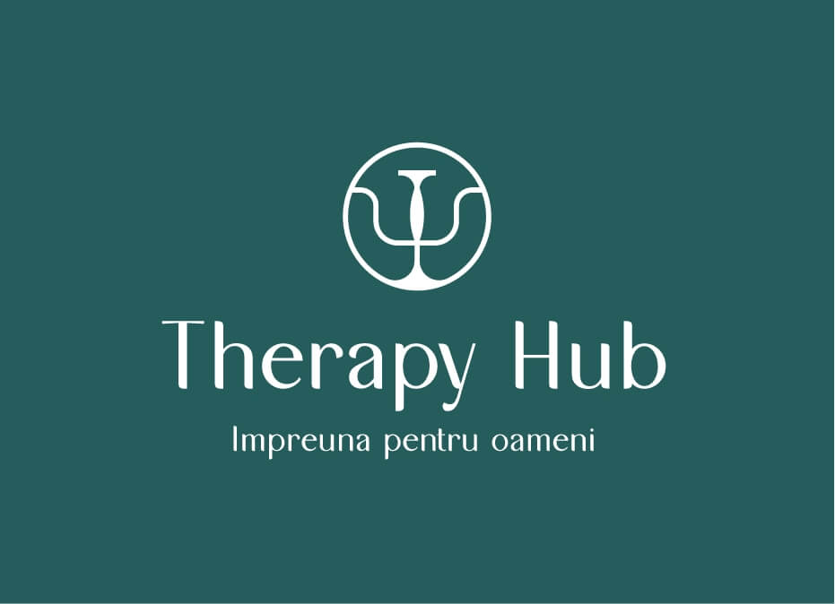

Version 2: PSY Symbol
• The logo represent the Greek letter PSY Ψ which symbolizes the concept of psychology
• The symbol is customized
• It also represents the balance and equilibrium
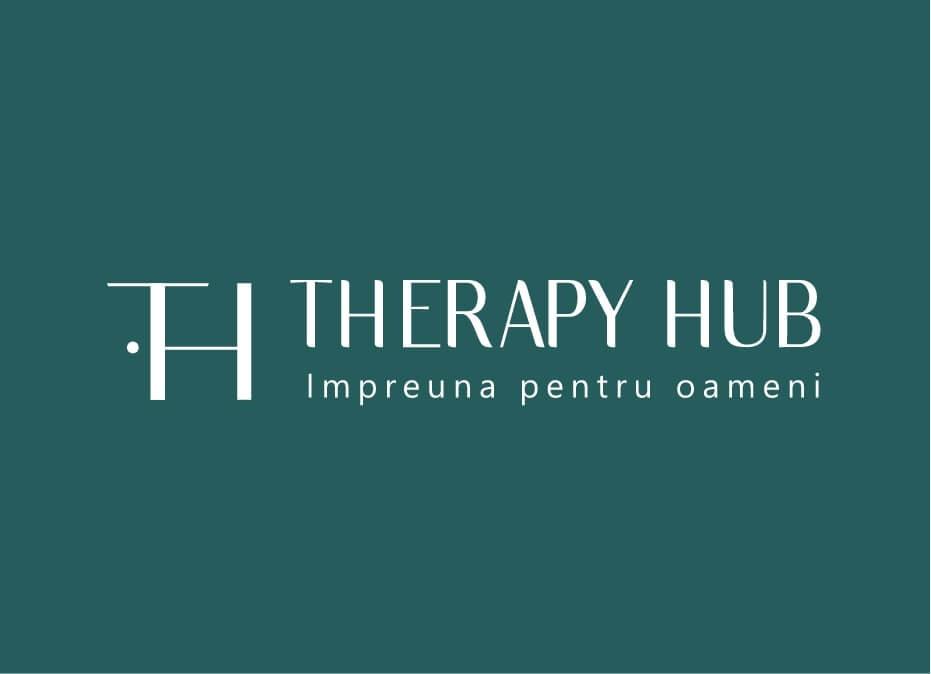

Version 3: Monogram + Hidden Message
• This is a simple, modern concept
• It represents the TH letters
• As a hidden message, the monogram represents a door to the left and some windows to the right – this symbolizes the idea of the hub and therapy spaces
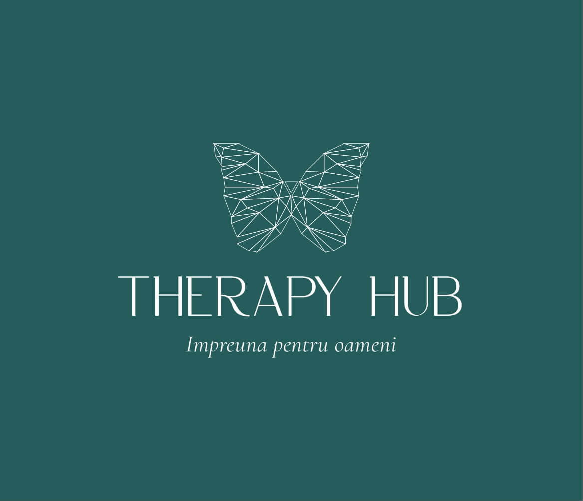

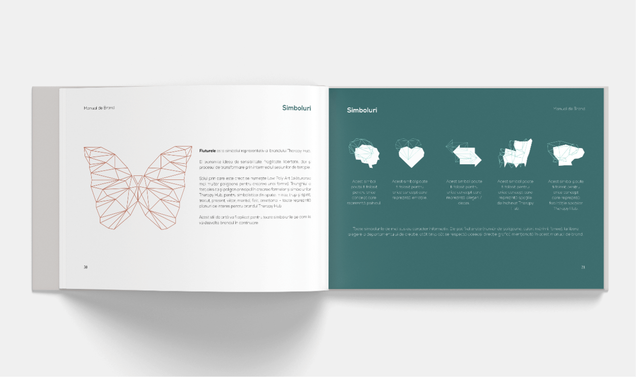
Version 4: Butterly
Some details about this concept below:
• The butterfly is a symbol for fragility, sensitivity, freedom and transformation
• The mark is formed only with triagles, because the triangle has spiritual symbolism: mind, body and soul; past, present and future; mental, physical and emotional – all aspects related to therapy
• The graphic style si called Polyart and will be applied on all Therapy Hub illustrations.
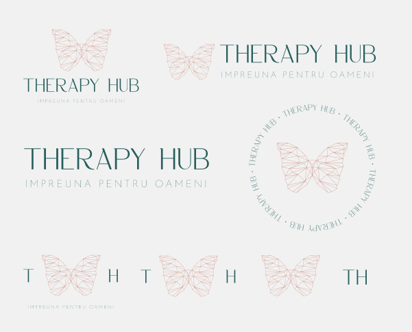
7. Logo System
When we finish the Logo, our partners see the many versions and forms and ask us, “Do I have to select only one?” and “Why are there so many Logos?”.
But we also ask, “What if you had a green backdrop and attempted to use the Logos on the right?” The elements in green, obviously, would not be visible.
We construct the Logo in numerous forms, formats, and colors, depending on its complexity, to ensure its best usage regardless of the setting, size, and colors on which it is placed.


8. Design System
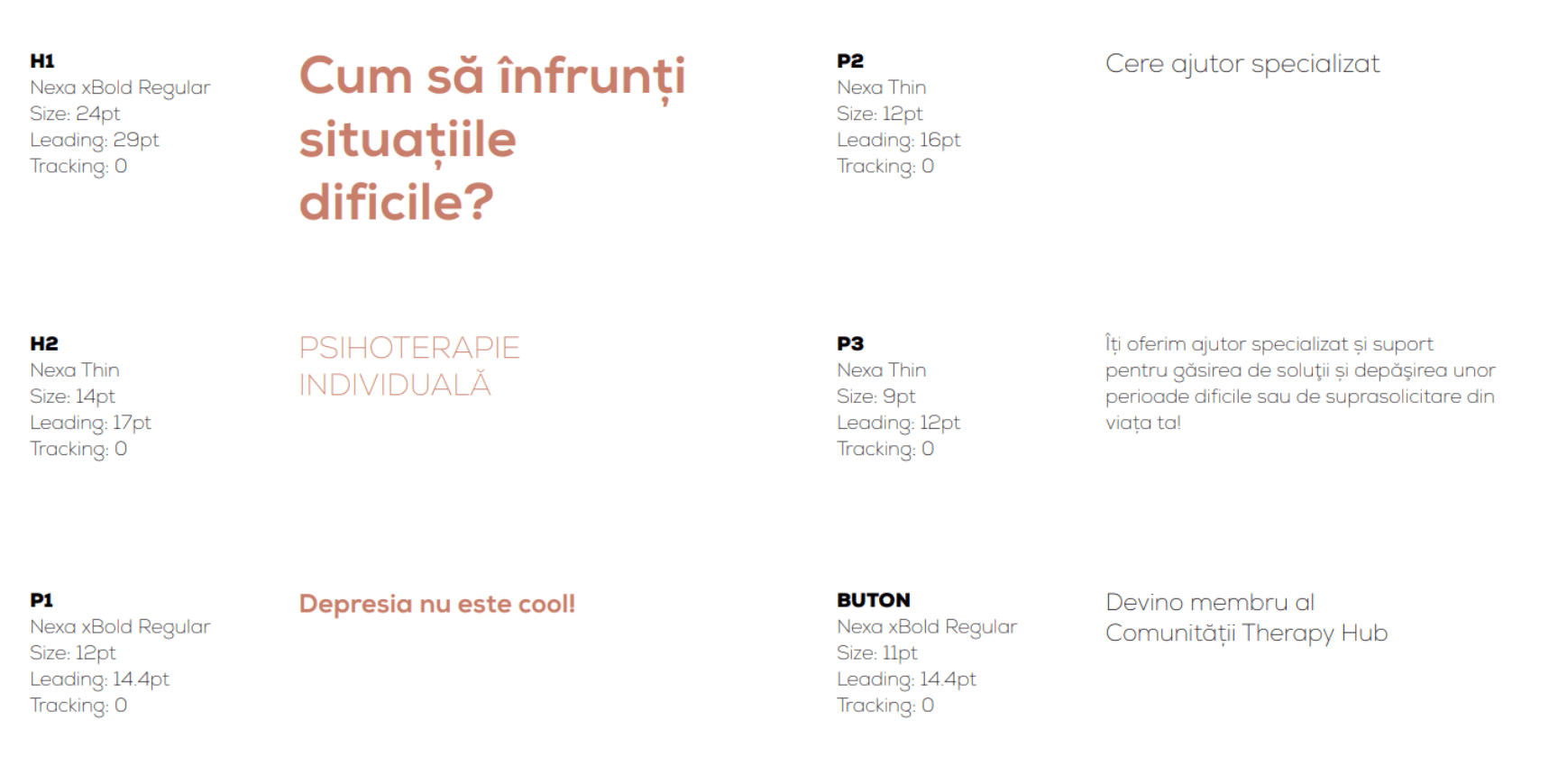
Many of the brands use multiple typefaces, different sizes, write in small or capital letters, and use and blend incorrect colors. All of these factors contribute to visual “clutter,” which is a brand’s worst enemy.
For Therapy Hub, we chose the proper color palette for the brand (modern and cool hues that represent professionalism) and developed a set of standards for the use of Fonts to achieve uniformity, visual clarity, and readability.


9. Authenticity
Authenticity. This word was repeated numerous times. But, aside from the Logo, what are the visual choices that contribute to authenticity?
The triangle, Therapy Hub emblem, and Polyart style served as the foundation for the overall visual identity. By maintaining the same style, the brand is able to develop market familiarity, differentiate itself, and connect with the audience.


So much information, understandably and entirely natural, can be daunting for some and extremely thrilling for others. But they’re all wondering, “What’s next?” How can we put all we know and have created to use for the brand?
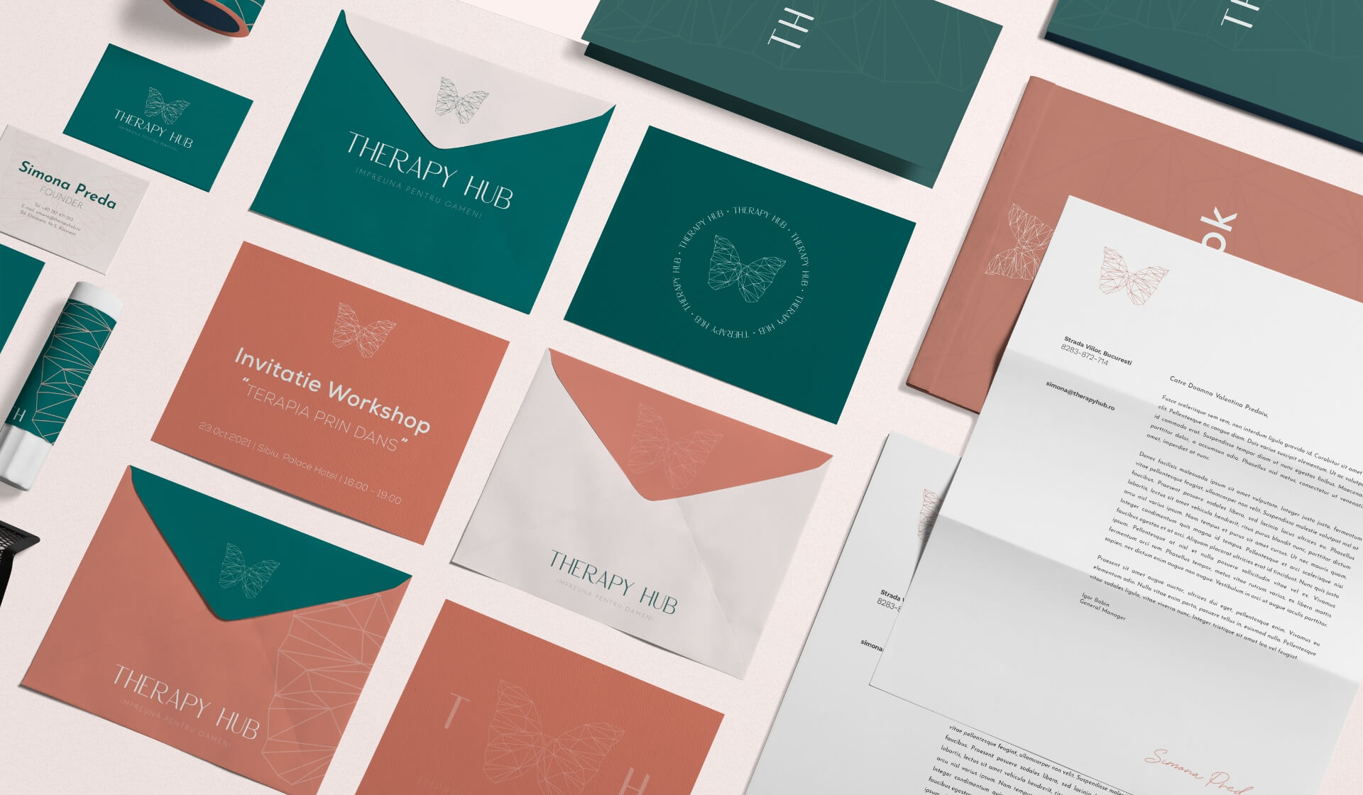
Simple! We firstly choose the brand collaterals our brand identity will be applied to. Then, we take care to obey all the rules we created earlier in the process to ensure the essence of the brand personality is represented.
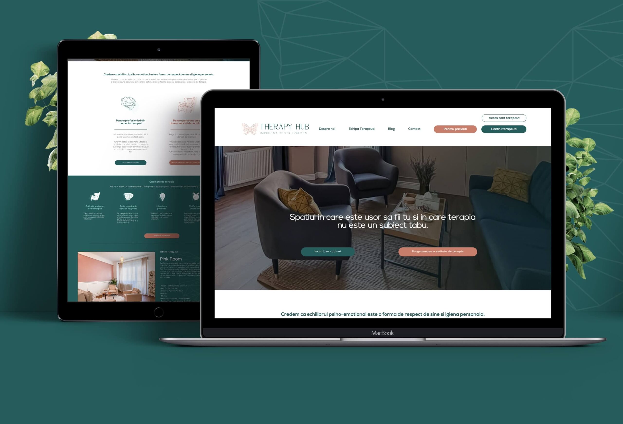
Website
We established the website structure and created messages that resonated with the audience. To differentiate the brand, we applied the color palette as well as the symbols and graphics created for the brand.


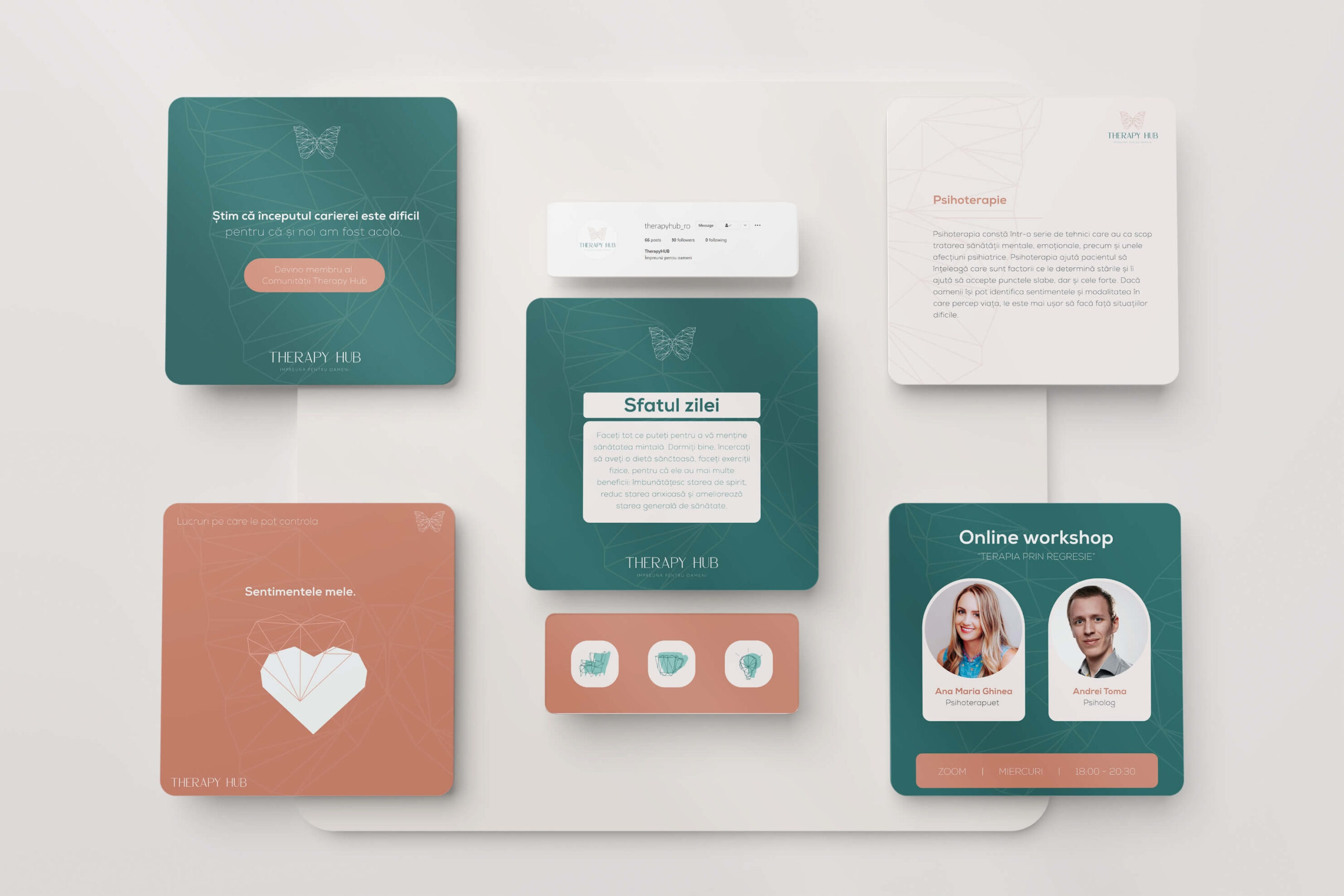
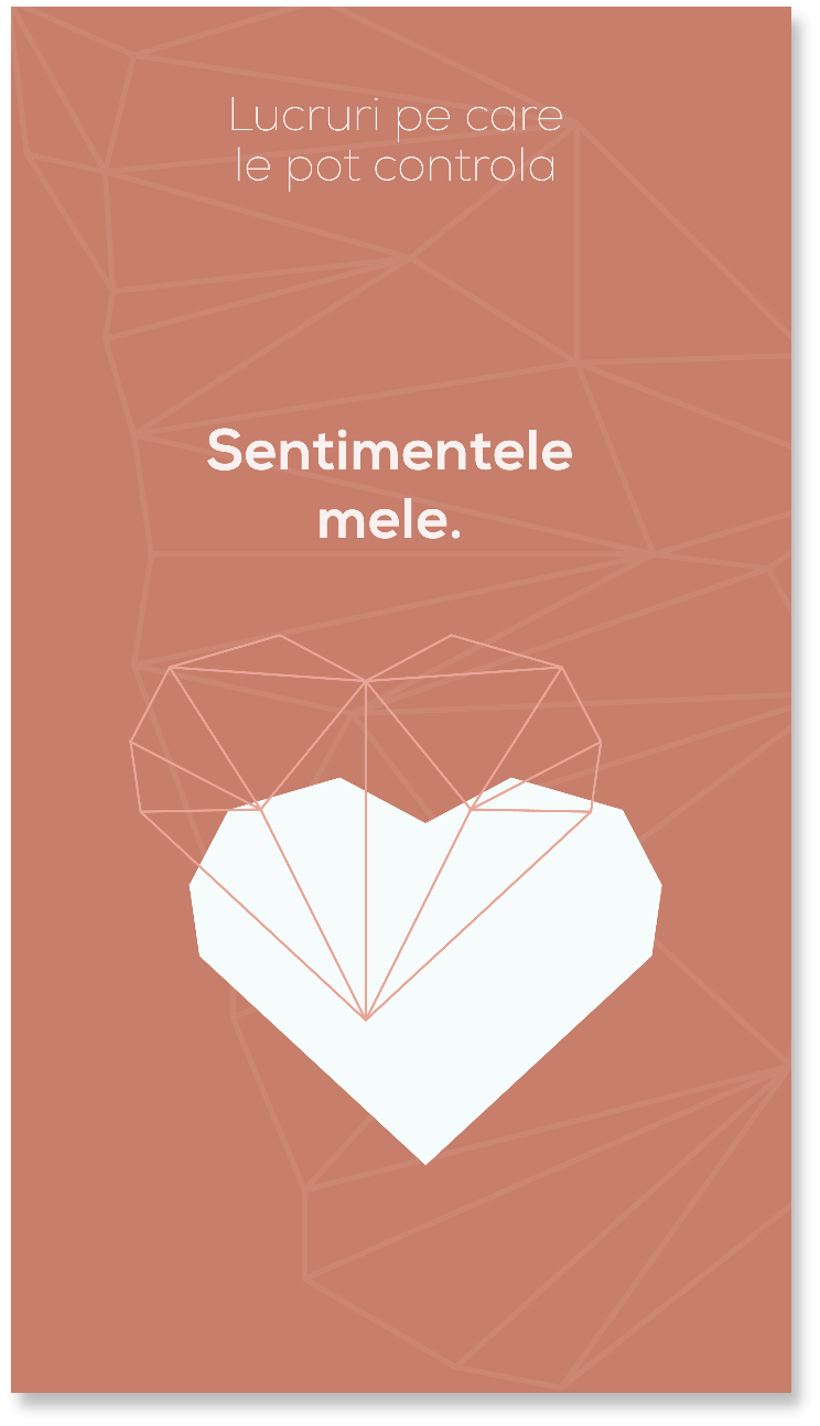
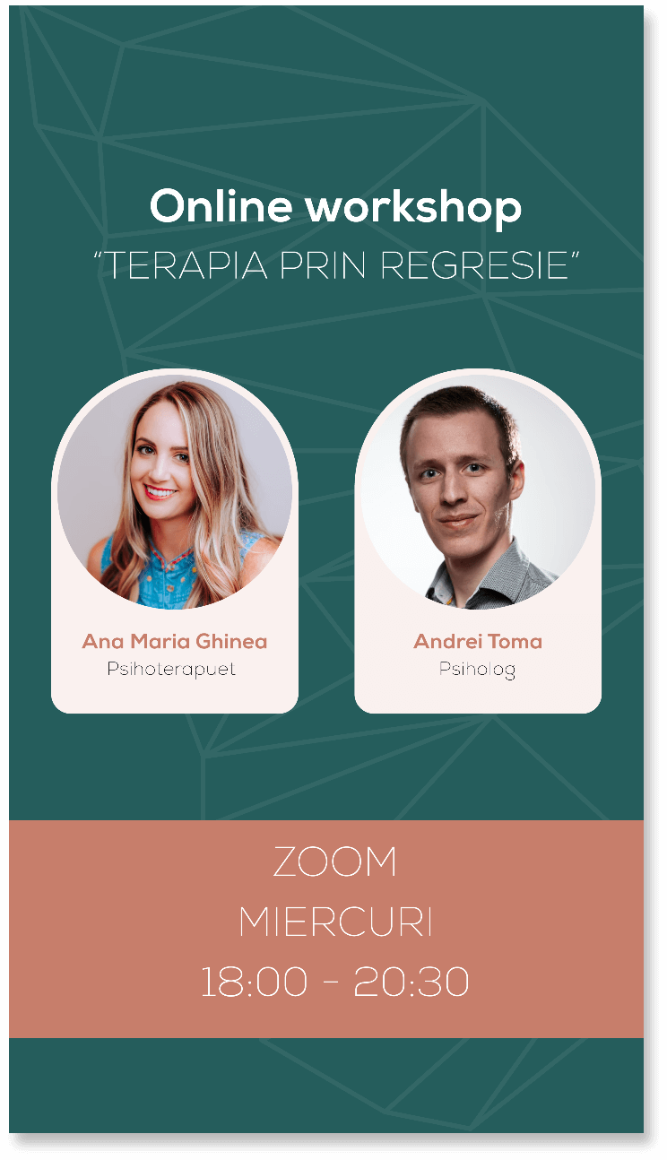
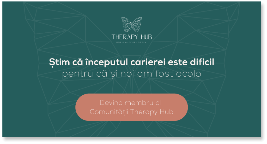
Online Ads / Posts
Every beginning is anxious, and the first post online, under the new brand identity, is no exception.
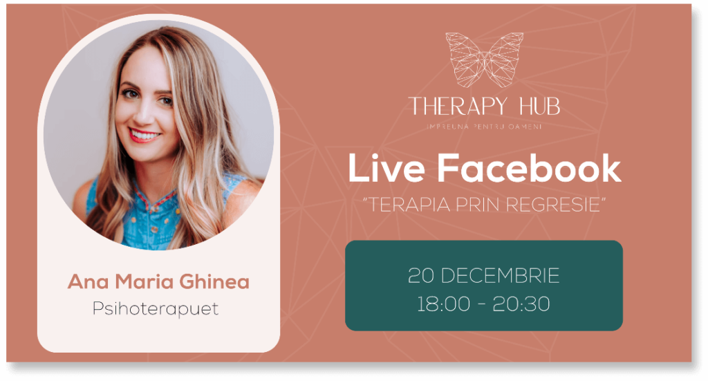
We create various types of visuals for the brand to address a wide range of topics (promotional offers, educational posts, testimonials, engagement posts, events). We collaborate with the partner to establish not just the categories of postings, but also the appropriate format (post, story, ads).
Thus, we generate templates easy to use. We assist our partners in achieving visual consistency, saving time and reducing stress, since the templates are simple to customize and there is no need for new graphic concepts, at least in the beginning.







Offline / Inside the location
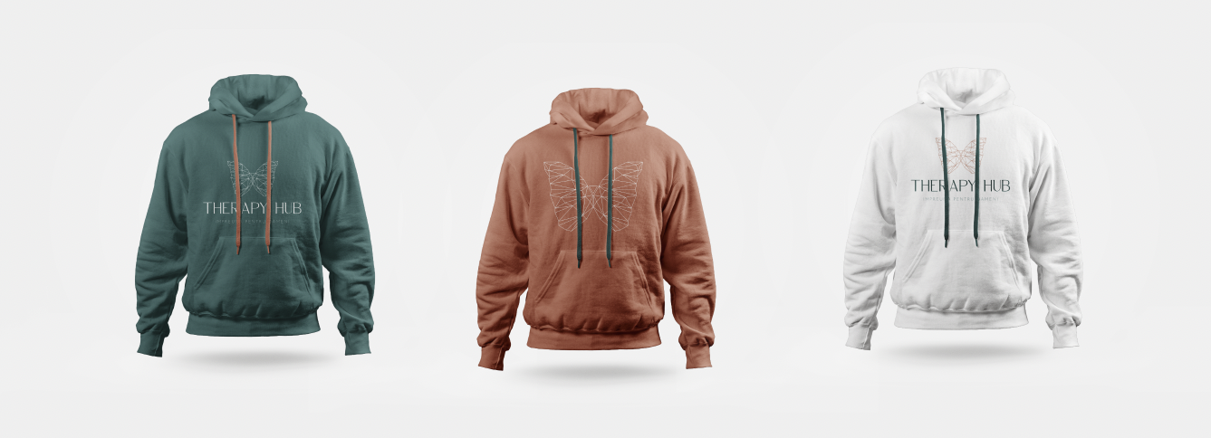
All companies want that their visual identity be integrated in the offline environment, from stationery materials and employee uniforms to the layout of the place.
For Therapy Hub, in addition to the warm and welcoming environment (specific to the Carer Archetype), having visuals and graphics from the Sage and Entertainer Archetypes was equally important.
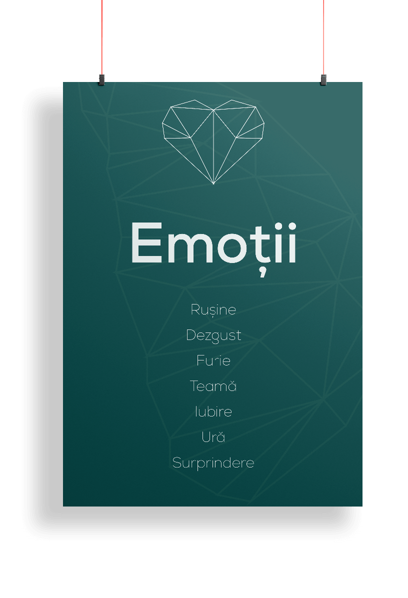
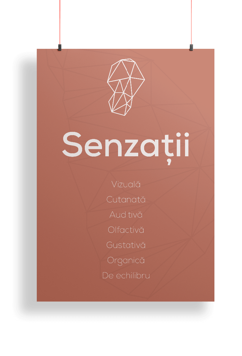
Thus, one of our partner’s decisions was to decorate the places with informative paintings and posters about therapy, as well as pleasant and cheerful messages that provide a sense of well-being to clients and patients.



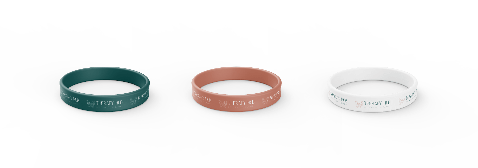
Brand Collaterals
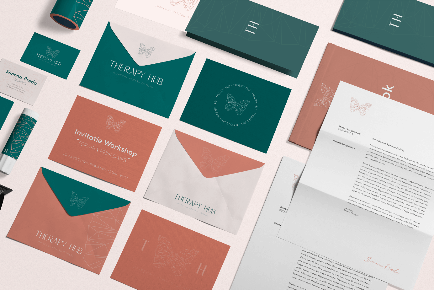
Each brand is different and therefore the need to create brand materials is also different. Perhaps one brand needs a menu, while another requires a design for packaging, boxes, or labels.
We determine the assets that we must develop and continue the creative process so that the customer connects with the brand as often as possible.


When new people are recruited or the brand employs an agency to handle promotion and communication on its behalf, everyone must be on the same page in terms of strategy, verbal communication, and visual communication.
The sales people must know the brand positioning, be aware of the benefits searched by their buyer persona and also the words and messages that create a connection between the brand and the customers. The creative people must know the design rules, in order to have visual uniformity.
The management must remember the mission, the vision of the brand, but also its personality and identify opportunities to motivate the team inside the organization.
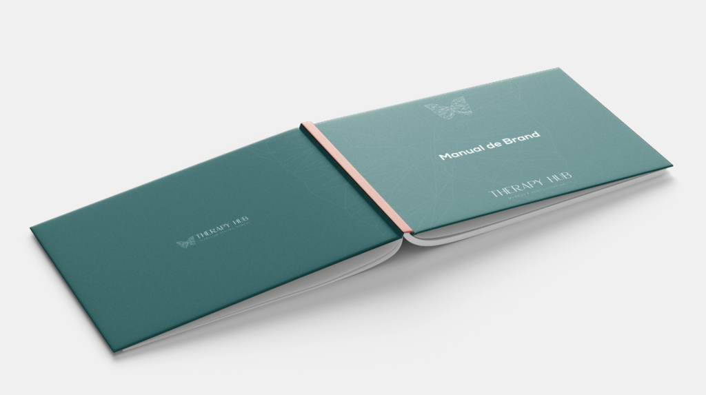
For such situations, we create a Brand Manual that contains the brand strategy and design and brand rules for the whole team. So that everyone knows how to act, how to communicate, and what to say, so that the brand remains authentic both inside and outside the business.




Email: contact@inobox.ro
Adress: Street Copaceni, no 46, et. 3, Bucharest
Working hours: L – V | 10:00 – 18:00
